MTD1Notes WEEK 2
Contents
MTD1 week 2
Summary of class 1:
History of media
- both medium and message
- technology parallels consciousness
Function of Media
- eg. Television Delivers People
- inform
- manipulate
New Marketing
- products become icons of grassroots movements
- ethics of product placement
Week2:
- authentic media?
- Images and their meaning
- signs
Images and their meaning:
Dove Evolution [1]
Media questions:
- Who is speaking
- What techniques are used to deliver the message
- What is the speaker’s intention
- Who is the intended audience
- Is the message true, correct, fair, complete?
- what are the tools of production
- who does it benefit
Parody [2]
Onslaught video [3]
Talking back to the media: palm oil critique of Dove by Greenpeace [4]
The impact of images
Venezuela – gov’t censorship of dead bodies [5]
Media coverage of the statue of Saddam falling – 2 versions] [6] [7]
Abu Graib [8]
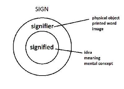
Signs
2 ways to understand images – semiotic (what images mean, what they stand for, imply)and formal (principles of composition)
signs - definition? - are culturally specific
- Iconic signifier– resemblance to signified[11]
- Indexical signifier – physical or causal relationship between signifier & signified[12]
- Symbol – sign where there is an arbitrary relationship between signifier and signified[13]
- denotative: what it is
- connotative: what it implies
images of shoes [14], [15], [16]
not always literally truthful – Cindy Sherman[17] Matthew Brady – civil war photos[18] OJ Simpson Newsweek cover(s) [19]
arbitrary relationship between sound and meaning decoded by radio commentator Rush Limbaugh: [20]
any message includes sender, intention, message,transmission, noise, receiver, and destination
Our understanding of the Intention of the creator influences our interpretation
Image structuring (a la Zettl)
6 major types of field forces
1. Main directions
2. Magnetism
3. Asymmetry of screen
4. Figure and ground
5. Closure
6. Vectors
Other principles
1. Golden Section
2. Depth
Major Principles
1. Everything operates w/in a framed field of view
- Horiz & Vert
- aspect ratio of screens
2. objects exist in context – in relationship to one another and to the framed field of view patterns
3. L-R & diagonals
4. Figure/Ground [21][22]richard schipps
5. Closure – completion of figure or pattern/object [23]
6. Vectors –
- graphic, (shapes)
- index, (pointing, signs)
- motion (movement real or implied)
- continuing/converging
Other Principles
1. Golden Section (thirds and fifths)
2. Depth (Z axis)
- Occlusion (overlap)
- Size difference between FG/BG
- Height
- Perspective (one or more vanishing points)
- Pattern compression
- BG “greyed out” (less intense, cooler hues)
- Focus
- Angle of view
Typography
Newspapers, medieval calligraphy
Helvetica: [24][25] Neutral, simple, international
Bush "Mission Accomplished"[26][27] "No president before Bush—not Kennedy, Reagan, or Clinton—relied on such huge typographic statements to get their messages across."
Obama and Gotham [28]
“It has a blunt, geometric simplicity, which usually makes words feel cold and analytical (like Univers), but it also feels warm. It’s substantial yet friendly. Up-to-date yet familiar. That’s a tough hat trick. And Gotham has another quality that makes it succeed: it just looks matter-of-fact. But perhaps any typeface inspired by signs at the Port Authority Bus Terminal in New York City — as Gotham is — will look like that.”
“Newer fonts don’t carry as much historical visual baggage…Among them would be a typeface called Whitney.” [29] [30]
“Whitney’s roots are in calligraphy, not geometry. So it’s a bit more handmade, more friendly.” [31] [32]
letters carved in stone [33]
doc on comic sans [34]
ban comic sans [35]
